Here’s a graphic for you to use as a quick-reference guide to put HbA1c numbers into context, and show the relationships between HbA1c, Blood Glucose, and GMI.
Unlike many of the “A1c chart” graphics that have been doing the rounds over the years, I’ve tried to strike a compromise between too-little and too-much information. I’ve also made it relevant to all types of diabetes, not just T1D.
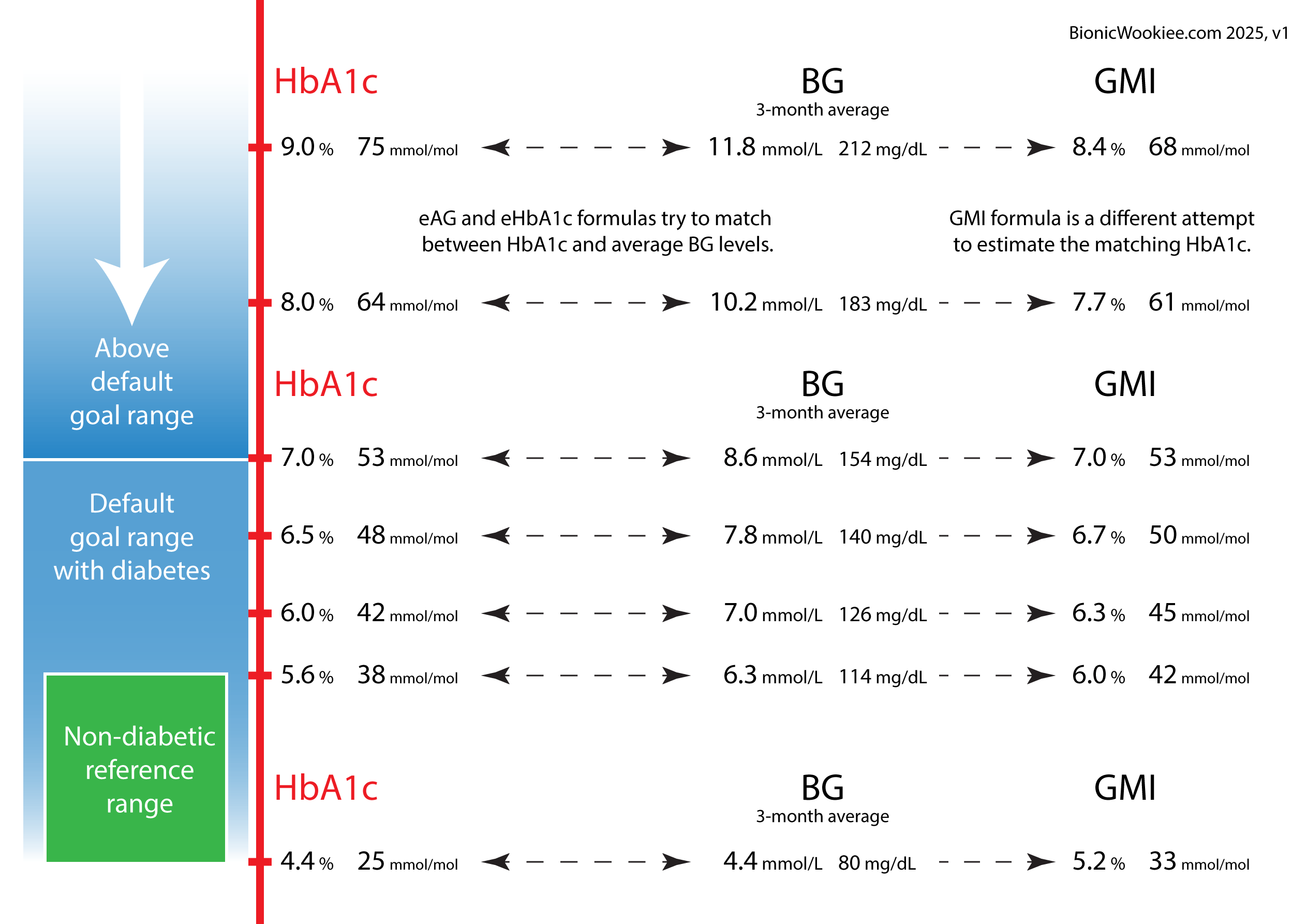
Regarding the selection of HbA1c levels:
- 4.4% and 5.6% feature as the edges of the “reference range” for people without diabetes.
- 6.5% is a level that can be a trigger for T2D diagnoses.
- 7.0% is the level that clinical guidelines advise to not exceed for long, as the risks of health complications have been shown to rise significantly above that.
eAG (estimated Average Glucose) is a value often shown on laboratory pathology reports.
It is the inverse of the eHbA1c calculation which estimates HbA1c from average BG.
In recent years many of the CGM vendors have been changing their software from using the traditional eHbA1c formula to the newer GMI. Sometimes still labelling it as “HbA1c”. I have previously written about GMI and its issues. I’ve tried to keep eHbA1c and GMI separate here, as they are different things.
Probably neither formula is perfect for everyone, but personally eHbA1c has always been a better match than GMI for my own lab results (ever since I started collecting detailed CGM records in 2017).
I hope this is useful to you!