I’ve written in the past about “Streaking“, and how expectations of getting 100% Time-In-Range can be unreasonable.
Any of us can be within range for 5 minutes, but the longer and longer we measure the harder and harder it gets to not cross either of those borders. Unless the range is unreasonably large of course.
To avoid stress about those border crossings, and any disappointment about the end of a streak, I’ve found it useful to instead aim at as high a percentage within range as I can manage. And not get fussed when it doesn’t stay at 100%.
This post is an exploration of what that can look like.
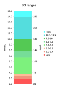 Before we start looking at graphs with lots of colours on them, we should clarify which colours mean what. In that context here’s the range of BG values we might encounter, split into coloured blocks.
The green bands together form the 3.9-10 mmol/L range commonly used for Time In Range (TIR). The lower two green bands together form the 3.9-7.8 “TITR” range, and the lowest/brightest green band is the 3.9-6.7 “TISR” range.
The orange/red bands are the sub-3.9, sub-3.5, and sub-3.0 low ranges, while the blue ones are the “above range” ranges. These colours have been chosen to help clarify the later graphs.
3 weeks of data
Here’s a summary of my recent CGM data. Over these 21 days I used multiple CGM sensors, multiple pump sites, and multiple pump reservoirs. Having the sample period longer than any of those change intervals should even out those issues.
This period also included some significant events such as birthdays, and several occluded pump sites. Luckily the pump occlusion alarms (which are usually rare for me) allowed me to correct the site issues before my BG rose too high.
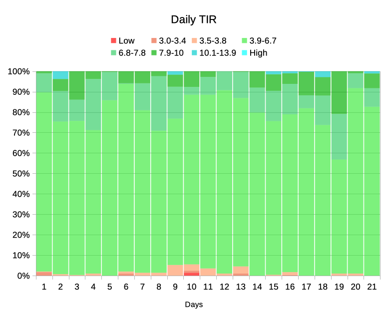
Unfortunately, the way this is arranged hides some of the data I’m interested in. For example it’s hard to see which days had higher TIR than others. But if we re-order the bands that becomes easier to see:
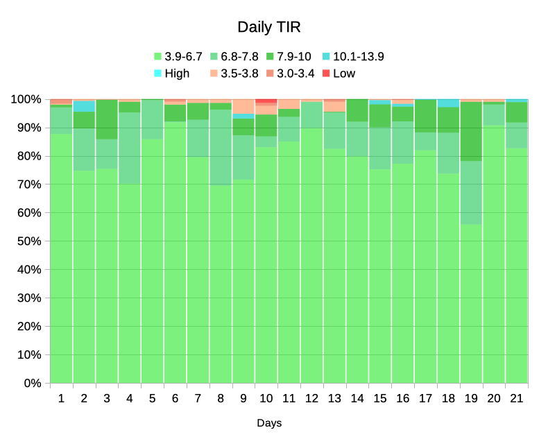
Now the green blocks start at the bottom, and I can see at a glance where the top of the TISR, TITR, and TIR blocks are. Above the green are the blue “high” blocks, and at the top are the reddish “low” bands. We can clearly see how far down the below-range sections come.
Mind you, as the green bands are so large it might help to crop off the bottom of the graph:
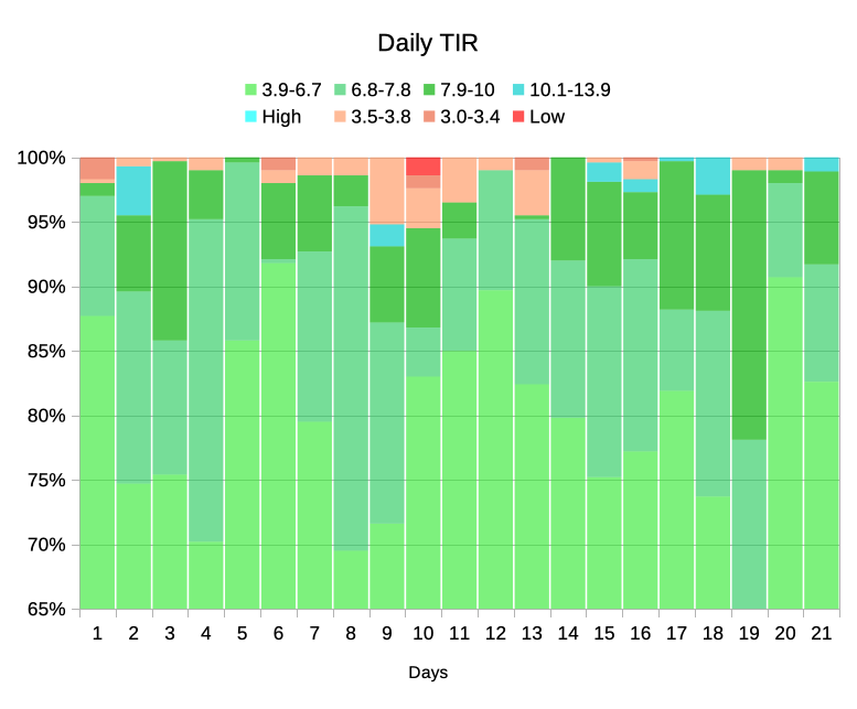
As you see, not every day is the same. I certainly didn’t achieve 100% TIR every day (actually only on two days, although others came very close) . Around Day 10 I had a few lows. It turned out this was related to a change in medication dosing, and after making a slight change to my default basal rates those reduced.
Remember, this is the same data and the same colours as the first version, just re-ordered and cropped to magnify the interesting data.
On Day 19 I had an “iffy” infusion site (but no occlusion alarm) which was probably behind me spending a lot more time above 7.8 than usual (it was a new site, my BG stayed a little high overnight, and I replaced the site in the morning) which is why the TISR band didn’t reach the 65% mark.
I expect that to many people it wouldn’t have been super-high, but it was notably different to usual so I acted to fix it.
Looking at the overall result
But just looking at individual days only tells us so much. Of course I’d like every day to be perfect, but Life Happens and I’m happy if I can simply keep up a consistent average result. As each day gets completed, the overall averages settle in. This can be clearly seen in the next graph.
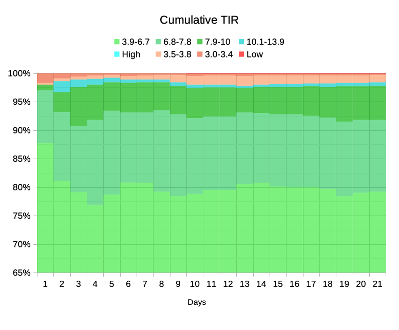
As you can see, the time spent below range (red/orange) did increase around Day 10 (mentioned earlier). As long as I don’t keep running into periods like that it should gradually subside. If I sampled just the last week the average time would be lower, but that feels like “cherry picking” and cheating.
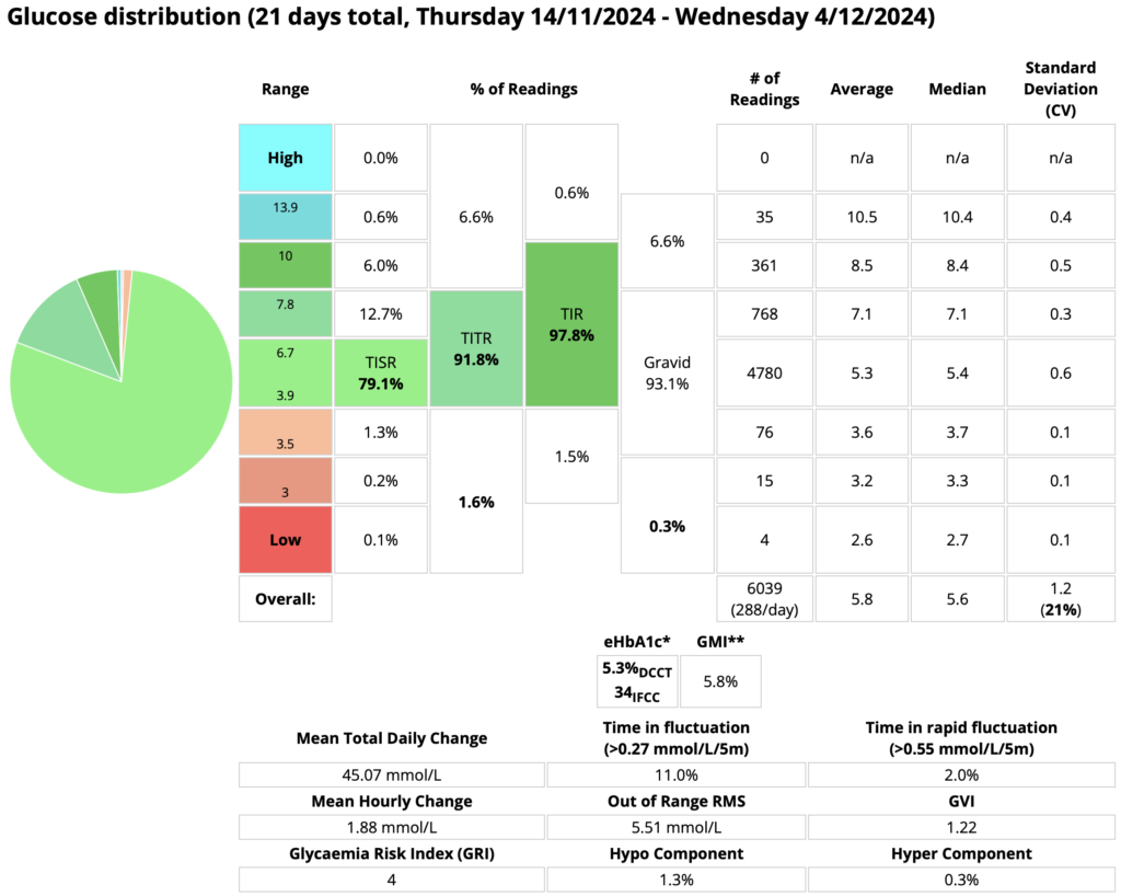
At the end of the 3 weeks, this was the final data:
After 3 weeks the time below 3.9 mmol/L was still only 1.6% of the total. Of course, 1.6% of each 24 hours equates to an average of 23 minutes/day.
Mind you, only 0.3% (about 4 minutes) was in the danger territory of below 3.5. And a few of those were probably false readings (e.g. compression lows).
In normal life my BG sometimes dips below 3.9 slightly (e.g. to 3.8) before coming up again by itself.
This contributes to the 1.3% in the 3.5-3.8 band, but although it skews the statistics I don’t regard it as a big medical issue. Remember, I’m not reacting to each of those “lows” and treating with food. Incidentally, I did reduce my time in this band significantly a while back when I tweaked my target BG from 4.9 to 5.1 mmol/L.
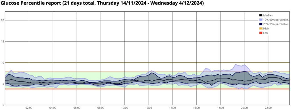
For some added context, here’s the percentile (AGP) report for the same period:
The two red lines are at 3.5 and 3.9, then the green TITR band up to 7.8.
That graph shows a pleasingly-compact shape. The “hump” in the early evening probably correlates with my occasional indulgences in things like blocks of chocolate and packets of Tim-Tams, but the impact of those doesn’t seem to last long.
Comparisons with others
I don’t usually try to compare my results with anyone other than my previous self. I believe that “gamifying” diabetes and “competing” with others can be psychologically damaging (for all parties!). The only way I usually regard it as a competition is against myself.
But I did find it interesting to compare with a cohort of non-diabetic folk. I never set out with the aim of meeting these numbers, but it’s amazing to see where I’ve ended up. I don’t have AGP data for large cohorts of people without diabetes, but I do have some statistics from the 2019 paper that I wrote about last year.
Across 153 people of various ages it reported the average time spent within TISR (3.9-6.7), TITR (3.9-7.8), and TIR (3.9-10). For the smaller ranges it also reported the InterQuartile Ranges. In graph form these are shown here.
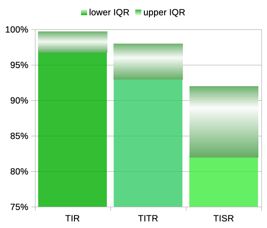
At the top of each column is a block showing the IQR, with the average values lit up towards the centre of them.
The eye-opening thing for me has been comparing my own average data. Here’s the data from the end of those 21 days:
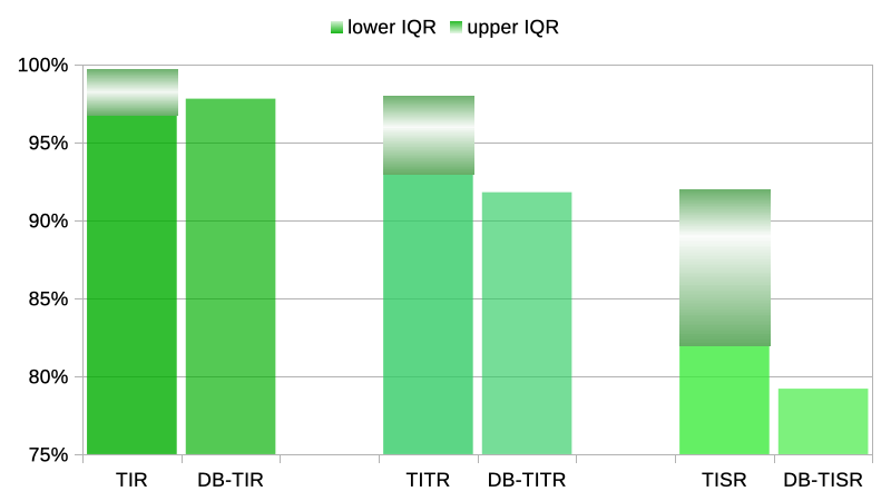
For TIR, at 97.8% I’m averaging well within their 96.8-99.7% range. As I started out saying at the top of this article, it’s not 100% but it’s as close as I feel I need to be. It’s something that I could hardly conceive of even 5 years ago, let alone dream of!
For TITR, at 91.8% I’m not quite within their 93-98% range. But I think amazingly close! Again, something hard to conceive until I actually got there.
TISR is really only here because this 70-120 (3.9-6.7) range was also reported on in that 2019 study. No-one’s actively using it as a metric at this point but seeing the TIR and TITR results, this inquiring mind wanted to see how it compared.
At 79.2% I haven’t reached their 82-92% range, but I’m still more than happy with it! Of course some days I did get within that range, but it’s the overall average which probably matters most.
How?
I started my personal work with fully-autonomous AID (“FCL”) some years ago, using AndroidAPS and the oref algorithm. Today I’m using a bunch of things to optimise it. Lotus is now my AID (still using oref at its core), along with things like fast insulin and adjunctive meds including metformin and linagliptin. Clinical trials are under way examining various of these things in wider cohorts than just n=1 (me) and we’re setting up more.
I don’t eat particularly low-carb, although I do try to keep my breakfast fairly low-carb to avoid the Break-Fast Phenomenon.
Continuity helps
There’s also an issue that many people don’t pay attention to: how often the system can actually make decisions and react to BG changes.
To start with, it helps if we can gather all the CGM data. In the report above we can see it gathered 6039 samples: an average of 288 samples/day. Which is how many we would expect with a sample every 5 minutes. Actually 288 * 21 would be 6048 samples, so over that time 9 samples were lost. One of the benefits of overlapping CGM sensors and avoiding warm-up delays (each 2-hour warmup would lose at least 24 samples, plus whatever delay happened before starting the new sensor).
But even so, sometimes the CGM app misses some data and has to back-fill it later. That wouldn’t be visible in the above statistic. Keeping the phone nearby obviously helps. But sometimes the system can’t communicate with the pump (e.g. because there’s a cat asleep on my lap blocking the signals, the pump’s in the middle of being refilled, etc). And sometimes it’s simply been taken offline (I suspend it while showering/swimming). The longer the system goes without being able to make updates (especially in the face of post-meal rises) the worse the result will be: with insulin time really is of the essence.
However according to Lotus’ statistics, over those 3 weeks it was able to act 96% of the time. The sobering thing is that’s an average outage of 52 minutes/day. Of course, the impact of such outages will be minimised if the BGs are stable at those points.
Years ago I observed that if my CGM real-time capture rate (without having to back-fill data) dropped much below 95% then the system results really started to suffer (here my CGM capture rate has mostly been close to 99%).
I haven’t yet made broad conclusions like that about the AID success rate (which is affected by more than just CGM delays) but 96% overall doesn’t seem to have produced a bad result here.
What next for me?
Here’s a historical graph.
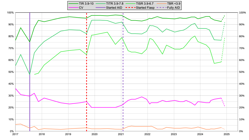
Since I stopped announcing meals in 2021 there have been various experiments (both failures and successes) in configuring the system, and the impact of those can be seen. But in 2023 I felt I had a fairly reasonable setup.
However 2024 has involved lots more experiments. For example I was a participant in some clinical trials (e.g. of new CGM systems) which involved my glucose levels being deliberately out of range some of the time (and “not as well-managed as usual” others). I’ve also been involved in testing some of those adjunctive meds, other insulins, etc.
As you can see, my results dropped off again. But I’ve learnt a lot, and although the last points on that graph are only for 21 days (rather than the 60-day samples for the rest of the graph) I’m happy to see the data seems to have bounced back.
I’m looking forward to seeing if I can keep it up for (at least!) 60 days. Keeping in mind that we’re now only several weeks away from “the feasting season” (Christmas/NY/etc). After that (in early January) I will be able to make the dashed portion on the right of the graph solid like the rest.
I’ve also got some medical tests scheduled for February which I’m looking forward to (and I would like to keep my glycaemia optimised leading up to those).
I just need to stop fiddling for a while!

Btw, could you please share Lotus repository link? Never heard of that before.
Thanks!
Sorry, Lotus itself is not yet available outside clinical trials. A bunch of its functionality will be made available to other projects, but maintaining the regulatory path for Lotus is our end goal.