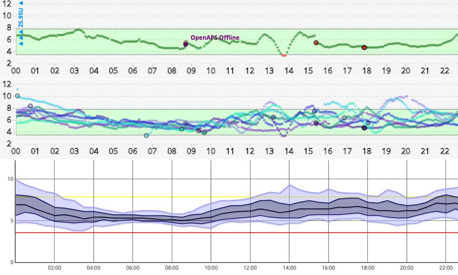
Our glucose data (whether it’s BG samples or CGM data) can be displayed in many ways. We can see a simple graph, a “spaghetti graph”, a percentile (AGP) graph, etc. These are all useful in different ways, but all I’m going to talk about here is the vertical scale on these graphs.

Many of us are used to seeing “linear” graphs, where the units on the vertical scale are spaced out evenly, with the same vertical distance on the chart always representing the same number of units.

Often the scale is fixed (for example showing up to 22) which can be annoying if you’re interested in seeing what’s happening down at the lower end of the range.
Some software can instead use a logarithmic (or “log”) scale, where the scale marks get closer together the higher they go. This has the advantage that it magnifies the “hypo” end of the BG range, allowing us to pay more attention in the moment and avoid actual hypoglycaemia. It also means that less space is wasted on the “hyper” regions.

One note of caution though…
Don’t confuse your doctor!
In the Nightscout reports you can select either logarithmic or linear scales for any of the reports. If you have logarithmic selected as your default for your normal view, that will be the default for the reports. But be aware that if you’re generating reports to show someone else (such as your medical team) they will probably not be used to looking at log scales.
 I always generate linear graphs in these cases, as otherwise the shape of the graphs fools the viewers, and what are actually small changes in the lower end of the range get mistaken for “hypo events”. And mild hypos get mistaken for “sudden/severe hypos”. This just results in wasted time in our medical appointments.
Yes we might like those changes highlighted to us in our day-to-day management of our diabetes (e.g. so we can avoid them becoming hypo events). But we don’t need our doctors getting confused and thinking we were actually having hypos at those times.
I stick with showing them linear (which is what they’re expecting) and avoid the misunderstandings.
Which is “better”?
It could be argued that the logarithmic scale better matches the physiology and the physics of the glucose sensors, but I’m not at the moment going to say much beyond “use whichever you’re comfortable with”.
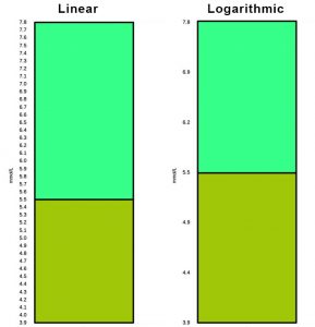
 But geeks may find it interesting to think about the classical clinical target of 5.5 mmol/L and goal range of 3.9-7.8 mmol/L. I mentioned 3.9-7.8 in a recent article as a goal range sometimes given for pregnancy.
That 5.5 target happens to lie at almost exactly the logarithmic “half-way” mark…
In US terms these numbers (3.9, 5.5, and 7.8) are 70, 100, and 140 mg/dL.
