More and more CGM software packages are doing away with “estimated HbA1c” and replacing it with GMI. A recent example was the revamped Sugarmate after they re-wrote their Dexcom interface and had to comply with the requirements of the Dexcom official interface. Unfortunately for me, I’m one of the people that GMI does not produce valid results for!
So what is “GMI”? It was introduced in the 2018 paper:
Glucose Manage Indicator (GMI): A New Term for Estimating A1C from Continuous Glucose Monitoring
Basically, it’s a formula to convert from the CGM-calculated average glucose value, to a number that’s hopefully indicative of a lab HbA1c (glycated haemoglobin) result. HbA1c has been a standard measure for decades as an indicator of the average blood glucose level over the previous 3 months or so.
I wrote about GMI back in 2020, and noted that it did not produce values that worked for me. The GMI number has always been significantly higher than the lab result. But it doesn’t do that for everyone. It’s worth looking at how they came up with the formula (outlined in the paper above).
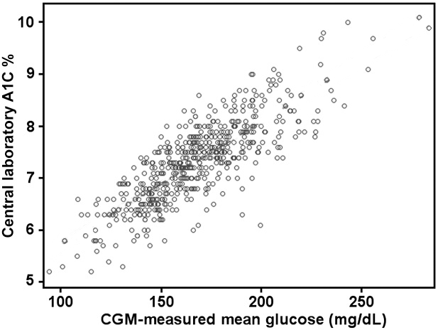
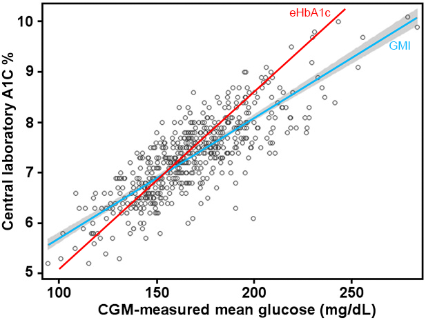
They took 528 pairs of average glucose values (each over 10-14 days) and matching lab HbA1c results (probably from 528 people) and plotted them on a graph. I’ve reproduced that graph here, with an extra line overlaid. As you can see, there’s a very wide spread of dots on this graph. At one level there does not seem to be a clearly defined linear relationship between the glucose and HbA1c values! If there was, most of the dots would be clustered along one line.

This points to the fact that there is more than just one factor involved. What we’re seeing here is only a 2D slice through what’s obviously a multi-dimensional data set. We just don’t yet know which other dimensions are significant!
We know that HbA1c results can be affected by different BG levels from longer ago than 14 days, despite the assumption in the GMI paper that 14 days was “good enough”. Physiologically we know that some of the haemoglobin being tested might be almost 120 days old!
We also know that HbA1c results can be skewed by a bunch of interferents (including anaemia and differences in average haemoglobin lifespan).
But on the whole it’s as though the medical establishment has thrown up its hands and said:
“Oh well. We’ll draw a straight line through this graph and make that the formula. Some people will be off that line.”
Using those 528 points, the authors of that paper applied a linear regression and determined that blue GMI line. Unfortunately due to the inflexible nature of the linear regression algorithm it’s possible that a few points far away from the centre can bias the whole line. Each point’s “importance” increases the further it gets from the centre of the cluster.
I’ve added a red line to the graph showing the “estimated HbA1c” (eHbA1c) formula which has been used for years prior. That formula was determined in a similar way as GMI, just years earlier and with a different sample set.
As you can see, for some points the GMI line may produce accurate predictions. And for others the eHbA1c line is better. The lines cross at about 7.0%. But many points are a long way from either line!
How it applies to me
After all I do have “skin in this game”, and I’m interested in how I can use these formulas in my own diabetes management.
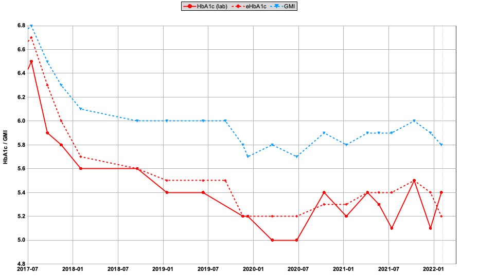
Expanding on my earlier article, here’s a comparison from the last 5 years of my own results.
 The solid red line shows lab HbA1c results. Using the average BG number calculated from my CGMs, the dashed red line shows eHbA1c and the dashed blue line is GMI.
For me the eHbA1c line is a much better match.
Note that these numbers only have a precision of 0.1, and due to rounding in the calculations sometimes the points seem to jump up/down slightly.
Where my average BG value has been dropping over time, the eHbA1c number has usually lagged behind the lab result slightly. That makes sense if the lab result is weighted slightly more towards recent data.
But going back to the earlier GMI dot graph, it’s obvious that my results are clustered in the lower left of the graph: closer to the eHbA1c line than the GMI line. And as expected, the further we get from 7.0% the larger the difference between eHbA1c and GMI.
But does it matter?
The lab HbA1c data remains a standard benchmark for many people. For a start it’s available for that majority of people who do not have access to CGM. Plus it can be measured retrospectively.
However industry consensus is that the CGM data is more thorough and more clinically useful (e.g. measuring both the highs and lows, and not just the average). TIR (Time In Range), TBR (Time Below Range), Coefficient of Variation (derived from the standard deviation) are just a start.
It seems obvious that if we have good CGM data available we should use it in preference to HbA1c. But some way of correlating these two measurement systems will remain important probably at least until everyone has access to CGM…
What now?
It’s clear to me that GMI is not the right answer, even if it’s better for some people than eHbA1c (which is obviously not the right answer either). I’m hopeful that a better answer appears at some point!


My a1c was way lower than this GMI would indicate and everytime i look at that data it the regression looks ‘wrong’ due to not many points at the low end and a couple of odd looking points at the high end.
Thanks. I have noticed this discrepancy and this is the most satisfying explanation I have found.