Continuous Glucose Monitoring gives us lots of data, and various attempts have been made to distill it down into simple metrics.
 This is a difficult job as there can be a huge depth of data available in there, which can be lost if we only look at high level numbers. But people are used to dealing with simple metrics like the HbA1c (which itself only contains simple information) so we automatically tend to look for a single metric to make a judgement on. For any given period of data we can see things like:
- eHbA1c (estimated from the average BG level).
- TIR (Time in Range) as a percentage.
Unless specified, this is for 3.9-10.0 mmol/L. - SD (Standard Deviation). A mathematical measure of variability (lower is better). Unfortunately it needs to be assessed in the context of the mean BG, which is why CV is preferred.
- CV (Coefficient of Variation). The SD as a percentage of the average (mean) BG. Sometimes this is referred to as the Relative SD.
I’ve previously written about Dexcom’s GMI metric, wondering what it’s supposed to actually correlate to.
Now I’m going to talk about the GVI and PGS metrics. These were introduced by Dexcom and are described in a Healthline article from 2012. They’re interesting metrics, but they do have some significant caveats.
Interestingly Dexcom no longer seems to use these metrics, although they are now supported in Spike and opensource tools such as xDrip+ and Nightscout.
GVI
The Glycaemic Variability Index is intended to show how much your BG varies, by looking at the “length of your line”. If we draw a jagged line connecting every BG point, a GVI of 1.5 would indicate that the line was 1.5x longer than a simple line joining the start and end. Each time the data jumps up or down, the length of the line increases.
The interpretation presented in the above article for GVI values is:
| GVI | Description |
|---|---|
| 1.0 to 1.2 | low variability (“non-diabetic”) |
| 1.2 to 1.5 | modest variability |
| > 1.5 | high variability |
On the face of it that seems reasonable, and a simple concept to get your head around when looking at a graph. However, there is at least one caveat. It’s to do with the input data.
Data smoothing
Common CGM systems from Dexcom and Medtronic supply one data point every 5 minutes (sometimes missing/skipping a few). At most there will be 288 points/day.
In an extreme case if we only had data at the beginning and end, the GVI would by definition be 1.0. The more data points we have, the more the possibility for the data to have curves, and the GVI to increase.
Although the Libre sensors gather new data every minute (and this can be seen in changing scan results, and through data read by NFC/Bluetooth transmitters), the Libre software collates data down into 15-minute chunks, so there’s only a maximum of 96 points/day to analyse. The data has been “smoothed out”.
Smoothing can also happen via adjusting values. The Dexcom transmitters are known to apply some smoothing to their data, although presumably Dexcom kept this in mind when developing the GVI metric.
Some other CGMs provide more points per day. Sometimes up to 1/minute (1440/day). If the data isn’t artificially smoothed, that could provide more resolution and accuracy for loop systems. But that could also result in a slightly more jagged line. Probably not enough to make a significant difference in the GVI number, but the effect is theoretically still there.
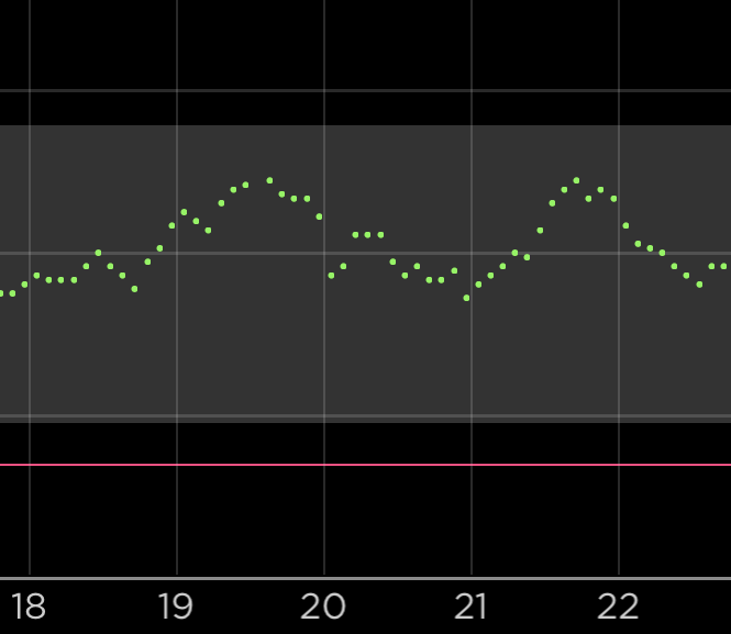
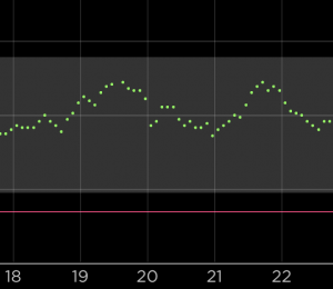 Whatever your CGM system, be aware that a “jittery” signal which jumps up and down (even if it’s just “fake” data from a compression low, “noise” from the system, or real jitter in your BG) has the possibility of artificially increasing the GVI.
PGS
The Patient Glycaemic Status takes the GVI, and combines it with the average BG (in mg/dL units) and the TIR (or rather the Time Out-of Range) to come up with a summary metric. It simply multiplies them together.
If your GVI was 1.3, your average BG was 7.1 mmol/L (128 mg/dL), and you spent 29% of your time out of range (i.e. your TIR was 71%), then your PGS would be
1.3 x 128 x 0.29 = 48
The interpretations suggested in the above article are:
| PGS | Description |
|---|---|
| 0-35 | “Excellent (non-diabetic)” |
| 35-100 | “Good” |
| 100-150 | “Poor” |
| >150 | “Very poor” |
Obviously this builds on the GVI metric, so the caveats mentioned earlier also apply here. But there’s another.
What’s your range?
TIR is not actually a simple metric like it’s used here. It’s really the percentage of time in a particular range. The PGS metric is expecting that you’re using 3.9-10.0 mmol/L (70-180 mg/dL) for the range. If you use a smaller target, that will make your PGS larger.
Unless you manage 100% TIR, in which case the PGS is 0.0 by definition!
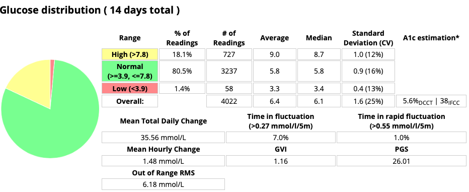 Be aware that if you use a different range for your personal goal, this will impact the PGS value if you or your doctor are comparing it to anything else. It should only be measured against 3.9-10.0 mmol/L for the PGS descriptions in the above table to apply.
For a discussion of using different goal ranges, see the earlier Targets and Goals article.
Conclusion
The GVI and PGS metrics are theoretically interesting, but in some ways quite flawed. I think they should be treated with caution!
Personally I find the average BG (or eHbA1c) combined with CV useful, along with the TIR (with the range declared). That’s as an overview, but I also keep an eye on the time I spend below target, and tools such as AGP/Percentile graphs do a good job at highlighting patterns I can address.

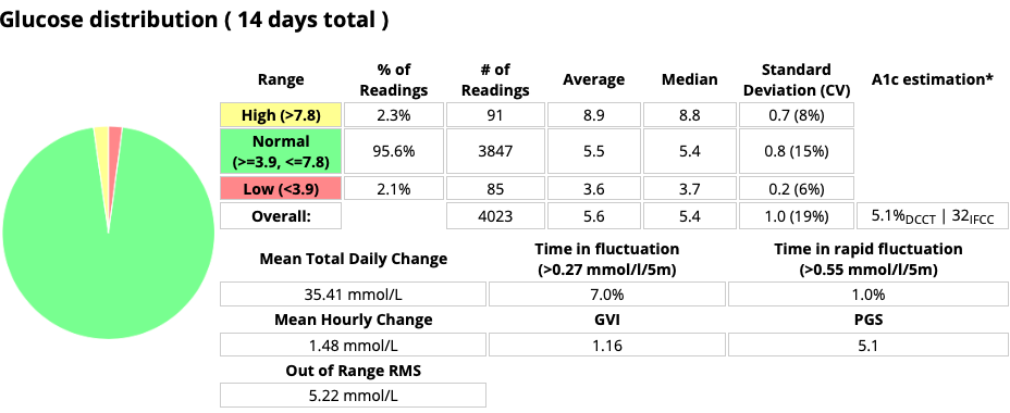
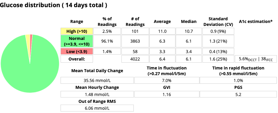
The PGS in particular looks like a ridiculous measure. When we multiply percentages we end up with junk no matter the application.
Well written, what else measure variability rate of change 2nd derative