Standard Deviation, Time in Range, HbA1c, etc. Do they correlate in any way? Sure they give us information about how our blood glucose levels have been tracking over the previous few months. But most of us only look at the latest figures.
I showed my own latest data in yesterday’s “What’s normal?” post. In preparing for my latest endocrinologist consultation, I decided to collate my own data over time to see if any patterns emerged.
An overview of the data
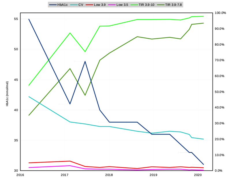
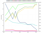
This graph shows the core data of this discussion. It’s only over the last 4 years, so this might not match everyone’s definition of “long term”, but it’s all I’ve got and it’s much longer-term than looking at just the last 14 or 90 days! By the way, at the beginning of this data (in 2016) I had already lived with T1D for 33 years.
There are quite a few lines on that graph:
- HbA1c (dark blue). Correlates with average blood glucose.
The HbA1c values in this graph came from laboratory blood test results, but have correlated well to the average BG results gathered by the CGMs. The blue line started out at 55 mmol/mol [7.2%] in this graph, and has reached 31 [5.0%] at the right. - CV (aqua). The Coefficient of Variation (or Relative SD). A measure of how much the BG is varying around the average (how “tight” your control is).
Common advice is to aim for something lower than 30%. In people without diabetes this is often down closer to 20%. - Low 3.9 (red). The percentage of time spent below 3.9 mmol/L (70 mg/dL).
While this is not “hypoglycaemia” per se, it is clinically recognised as a warning level. This is the boundary I’ve been aiming to stay above. - Low 3.5 (pink). The time spent below 3.5 mmol/L (63 mg/dL). This is getting closer to true hypoglycaemia.
- TIR 3.9-10 (light green). The percentage of time spent in the 3.9-10 mmol/L (70-180 mg/dL) range.
Common guidance is to aim for at least 70%. - TIR 3.9-7.8 (dark green). The same but for the tighter 3.9-7.8 mmol/L (70-140 mg/dL) range I’ve been aiming at in the last year.
Data sources
The HbA1c data here is from lab blood tests. Everything else is from CGM. All the data from 2017 onwards was gathered by xDrip+ with various sensors, regularly calibrated to blood glucose. The 2016 data was gathered by a Libre Reader. I did not record all these metrics at the time, but for the purposes of this article I went back and recalculated them from the raw data.
Where possible the CGM data was analysed over 90-day periods directly correlating with the blood draws for the HbA1c results. Some of the 2016/2017 data had to be analysed over slightly shorter periods (but still 58+ days).
Timeline
The lines jump around a bit at the left of the graph, so a little explanation is in order.
In early 2017 I was using an ordinary insulin pump. I worked on managing my BG by watching what I ate, and aggressively bolusing to keep my BG in range. Unfortunately in retrospect my basal/sensitivity/carb settings in my pump were off, and although I ended up with an HbA1c of 41 mmol/mol [5.9%] I had too many hypos. None of them were emergency events needing assistance, but they were well below 4 mmol/L. With my endo’s help we adjusted the pump settings, and my next HbA1c was 48 mmol/mol [6.5%] but with fewer hypos. The drops in the red and pink lines are obvious.
Almost immediately after that I started looping (initially using OpenAPS, but later transitioned to AndroidAPS). Ever since then there have been continual improvements in my results. In late 2019 I changed insulin from Humalog to Fiasp, which seems to have enabled further improvements.
Initial analysis
Some things were immediately obvious to me. Here’s the graph again.

The correlation between higher TIR and lower HbA1c seems obvious. I’ve written previously that HbA1c does NOT make a good target, and that by aiming at increasing the TIR, a lower HbA1c has been a result. I’ll explore the correlation in more detail further below.
In general, all the metrics have been moving in the directions I’ve hoped for.
The first one many people will notice is that my HbA1c has been steadily dropping. Without an increase in hypoglycaemia.
Once I started looping, my time below 3.9 mmol/L dropped from 5-6% to 1-2%. It’s been fairly stable now for a long time, although I keep working to reduce it further. Some of that time is actually “fake” data due to compression lows and calibration errors, although I wasn’t able to remove those from this data.
As the TIR for 3.9-10 approached 95%, I found it useful to narrow my goal range. It’s clear to me that a smaller range provides more resolution in the short term numbers to aim for.
The jump up in TIR for 3.9-7.8 in late 2019 seems to correlate with my adoption of Fiasp insulin. It has let the closed loop react to BG changes more quickly and stay closer to the target. The CV improved at the same time.
HbA1c history
To put these recent HbA1c results into some context, here’s my history going back to 2001. I don’t have HbA1c data from the previous 17 years of my diabetes, and no TIR/etc data from before CGM.
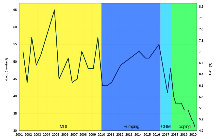
I like to characterise this into the four periods shown:
- Multiple daily injections. Intermittent BG recording, and the HbA1c result was a surprise each time. Values ranged from 44 mmol/mol [6.2%] to 65 [8.1%].
- Pumping, where I started out carefully carb counting. Using the pump for corrections helped, and I did more BG measurements than previously. HbA1c results from 43 [6.1%] to 55 [7.2%].
- CGM, where I could see what my BG was doing and tried to address it “manually” on the pump. At least the HbA1c results were no longer surprises.
- Looping. A steady and continual improvement!
Correlating data
Taking all the results from since the time I started using a closed-loop system, I decided to look at correlations between HbA1c and TIR. These can be seen in this scatter plot, with a trend line for each set.
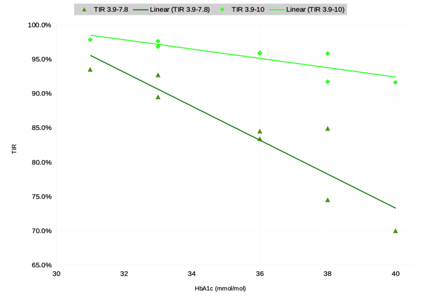
Overall there does seem to be a correlation! The correlation does not show causation, but it seems obvious based on my own experience that targetting TIR is likely to improve HbA1c.
However, I hesitate to extrapolate too far from this correlation. It may be tempting to assume (following those trend lines) that this means that if I reached 100% TIR then I would have an HbA1c around the 29-30 mmol/mol [4.8-4.9%] mark. But that is missing some important data!
For example one thing that is not shown is the selection of target BG I’ve been telling my loop system to aim at. As the CV improves and I’m able to maintain a narrower band of BG results, my risk of hypoglycaemia decreases and I may feel safe to aim at a lower target. That is very likely to affect the average BG, which would directly correlate with a lower HbA1c.
I don’t expect that this is likely to have a huge impact though, as I like having a reasonable “safety buffer” from hypoglycaemic territory to handle things like exercise and CGM calibration errors. And thus I’m unlikely to aim any lower than now. But it’s possible that the trend may “curve a bit” over time. My default target BG started out at 5.5 mmol/L, and has varied down to 5.0. It’s currently set to 5.1 mmol/L.
More data: different patterns
Jumping to conclusions from minimal data can definitely be a trap. For example here’s the same graph with the addition of data for the smaller 3.9-7.5 mmol/L (70-135 mg/dL) range.
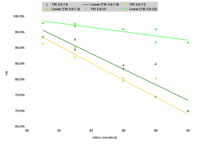
Suddenly a simple extrapolation looks like it might reach a lower HbA1c. And it might, as more TIR for a smaller range correlates with tighter control and thus increased freedom to lower the target BG. But don’t trust such simple extrapolations too quickly.
 Just for completeness, here’s the original graph with the TIR 3.9-7.5 line added.
Other TIR/HbA1c correlations
The recommendations from the International Consensus on Time in Range (https://doi.org/10.2337/dci19-0028) point to some other data on correlations between TIR and HbA1c. Two studies from 2019 in fact.
One study (“Beck et al”) had 545 participants with T1D, while the other (“Vigersky and McMahon”) had 1137 participants with either T1D or T2D. Graphing their results might put the above data in some context.
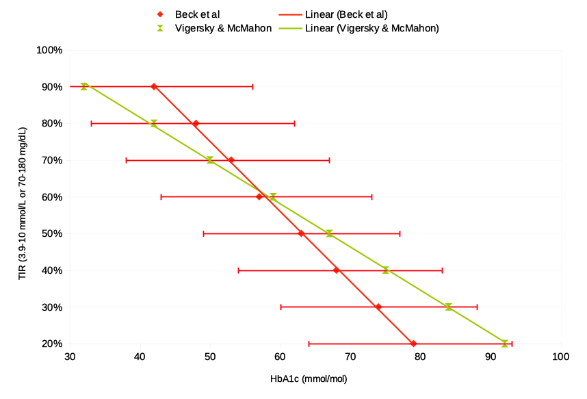
Again I’ve overlaid a trend line on each set. As well as the summary average data, Beck et al provided 95% confidence interval data which I’ve put in as “error bars”. The sets obviously aren’t identical but as the Consensus Report points out, there are many factors such as differences in BG recording (CGM vs fingerprick data) as well as the details of their diabetes. I guess it’s possible that other factors such as age may have affected the data too.
It’s obvious from that graph that there’s a general trend in the population, but there’s also a lot of variation amongst individuals. Their TIR data will be for the classic 3.9-10 mmol/L range, but I can overlay my own small number of data points and see where I fall:
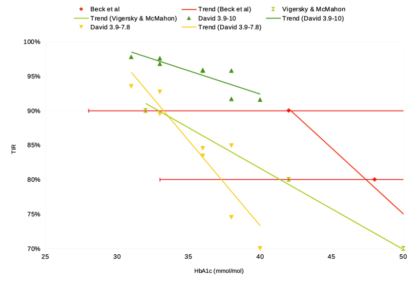
Certainly my data does seem to fit the general pattern, but I am just n=1 instead of n=545 (or 1137). Again there are more factors that affect the HbA1c than just the TIR, whether it’s the target BG or a host of other issues. So it’s dangerous to draw too-detailed conclusions from this data.
Goal HbA1c?
When I started looping I knew I wanted to:
| Improve my TIR. In my mind it was “narrow my range” as I knew I was bouncing all over the place. |
Quality of life |
| Reduce my risk of hypoglycaemia. | Short-term health |
| Have a better HbA1c. | Long-term health |
The reference range for “normal” HbA1c reported by the labs that do my tests has been 25-38 mmol/mol [4.4-5.6%] for a long time. Approaching and entering that range has certainly made me more comfortable regarding the risks of long-term health damage.
When I quickly reached 40 [5.8%] and then 38 [5.6%], I was grinning. At the time I could imagine maintaining something around the 5.4% mark and being happy with it. I didn’t want to aim for a super-low HbA1c at the bottom of the reference range (there are people out there who see 26 [4.5%] as their “normal” to strive for, although I still can’t see myself doing that).
But over time as my control has improved even further, gradually I found lower figures imaginable. Now I’m at 31 [5.0%] which is right at the centre of that reference range, and am feeling quite comfortable here.
I don’t feel the need to aim at still-lower levels, but who knows what will happen in the future? Maybe future tools such as URLi (“Liumjev”) insulin will allow more flexibility than I already have? Time will tell, but in the meantime I’m happy!

Impressive analysis and results over time. Great stuff!
Good work and analysis.
There is no data showing <5% a1c is actually healthy. Some data showing negative health effects.
So I'm glad you aren't shooting for that.
I question if people should, just because they can. It's not something non-diabetic healthy people ever care about. And they are… Healthy.
Very impressive data and achievement. I’m LADA so not on insulin (yet) and have been able to maintain my time in range and HBA1C around 5.5% with diet and some metformin but this makes me less nervous if and when I have to go on insulin. My father was Type 1 in his 20s and the technology has come a long way in the last couple of decades.
Impressive data and analysis. Convention would suggest flipping the axes in your graph of A1c vs TIR, the A1c is the dependent variable, so it should be plotted on the y axis (i.e. it’s changes in TIR that affect the A1c, not the other way around).