Last month I mentioned that I had modified the parameters I was using for the insulin activity/IOB modelling in my AID/loop system. Specifically, for Lyumjev and for Humalog I’m now using 9 hours in the exponential IOB model. I showed statistics from two 4-week samples of Lyumjev, and then a 7-day sample using this timing in Humalog.
Do note that this 9-hour “DIA” is different to the 5-hour “duration” in Control-IQ, and the “insulin action time” in the Medtronic 780G (where 2 hours is apparently optimal).
These are all different numbers because they’re different variables in different algorithms! Just with similar names.
One of the big changes I noted was an improvement in the TBR (Time Below Range, or more-specifically Time Below 3.9/70). And this wasn’t with a change in dosing behaviour on my part: this is all with my oref1-based AID running in a “fully closed” setup where I don’t manually bolus or even declare food. My main interaction with the system is to tell it when I’m going to be exercising.
A new snapshot
It’s now a month later, and the regular bloodwork for review with my doctors has rolled around. I’m about to make some further changes to the system, so it seems like a reasonable point to review how the system has been going on.
Based off the CGM data for the last 60 days:
| TIR 3.9-7.8 (70-140) | 87.6% |
| TIR 3.9-10 (70-180) | 96.6% |
| TBR 3.9 (70) | 1.9% |
| CV (relative SD) | 24% |
| eHbA1c | 5.4% |
| GMI | 5.9% |
Lab results
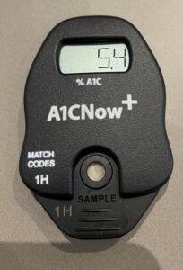
Given those e(stimated)-HbA1c and GMI numbers (we know those equations only match each other at 7.0%) what did the lab say?
Immediately after having blood drawn for the lab I used a POC A1c tester, and it produced exactly the same number as the CGM estimate. This was a start, but I was interested in the actual lab results. Last time I compared this tester to a lab there was a significant difference. So I had to wait a few more days.
But in the end, the lab agreed! I’m used to my lab HbA1c results being within 0.2% of the CGM eHbA1c. 0.0% is even better.

Back to the CGM data
Here’s the percentile graph showing the average distribution across the day:

As usual with AID/loop systems, it’s doing a great job overnight, but then has to cope with the vagaries of food/exercise/etc through the day.
Experimenting with different ways of presenting the data, next here’s a new graph. For that same 60 days, here’s the TIR/TBR data for each day. From the left you can see the time spent in the 3.9-7.8 range, then up to 10 mmol/L. On the right in red is the time spent below 3.9 mmol/L, and the blank space in between was the time spent above 10 mmol/L.
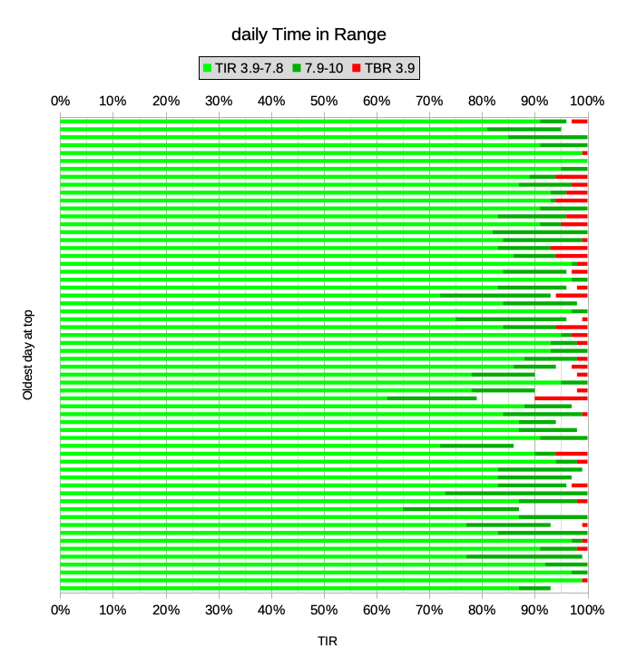
Together those light and dark green segments overall averaged 97% “Time In Range”. Obviously not every day works out that way though.
Then there’s the average 1.9% time below 3.9 mmol/L (admittedly that’s still 27 minutes out of an average day). But of course it makes no distinction about how far below 3.9 it is. If I float along for a while at 3.8 and then drift up again, that still counts as a “hypo” statistic here, even though it’s not really a hypo. More on that below.
How does this compare?
I thought it might be worth revisiting the suggestions from the 2019 report Clinical Targets for Continuous Glucose Monitoring Data Interpretation: Recommendations From the International Consensus on Time in Range. You can tap on the image to zoom in.
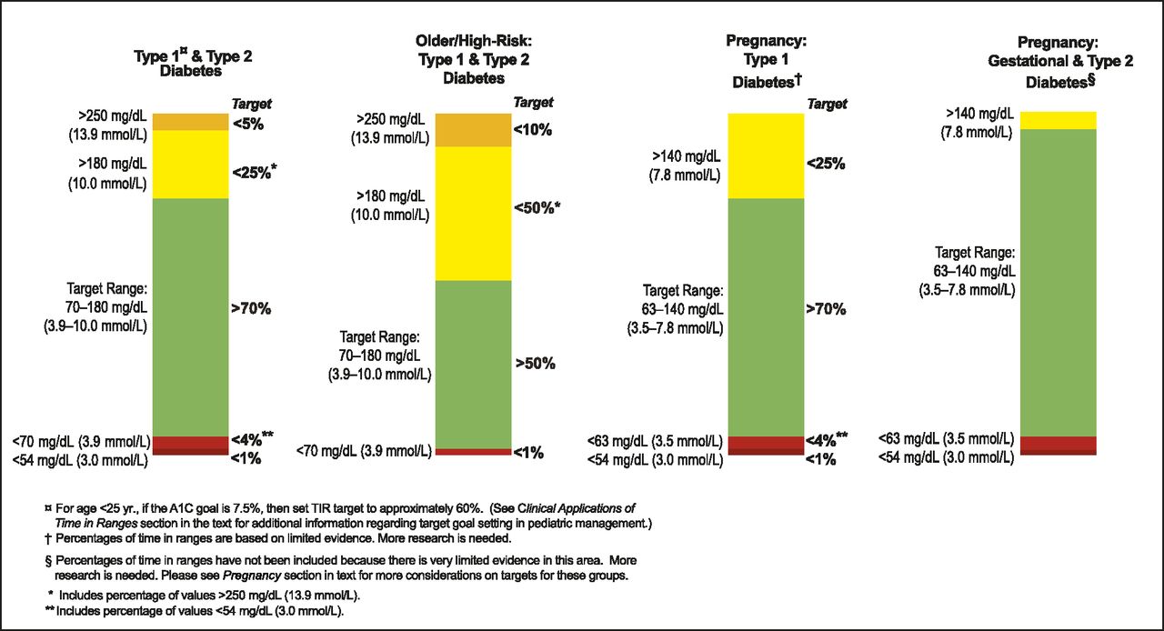
Personally I feel these are conservative targets for me, but I find the context interesting. Taking that left column, I can feed in my latest data:
| default clinical goals | David’s latest stats | |
|---|---|---|
| Time Above Range: TAR (13.9) | <5% | 0.0% |
| TAR (10.0) | <25% | 1.5% |
| Time In Range: TIR (3.9-10.0) | >70% | 96.6% |
| Time Below Range: TBR (3.9) | <4% | 1.9% |
| TBR (3.0) | <1% | 0.0% |
So I suppose I could pat myself on the back after comparing myself against that “low bar”. But the data hasn’t always looked that way.
Comparing with myself
I’ve shown similar graphs in the past, showing my stats going back a few years. It’s a busy graph, but I’ll try to break it down. I started using an AID/loop system in 2017. For a long time this was with the traditional setup of declaring and bolusing for food, and having the loop manage things between those points.
The black bars on the chart indicate the 60-day timeframes of the statistic samples. Across the timeframe of this graph my lab HbA1c has been in the range 5.0-5.6%.
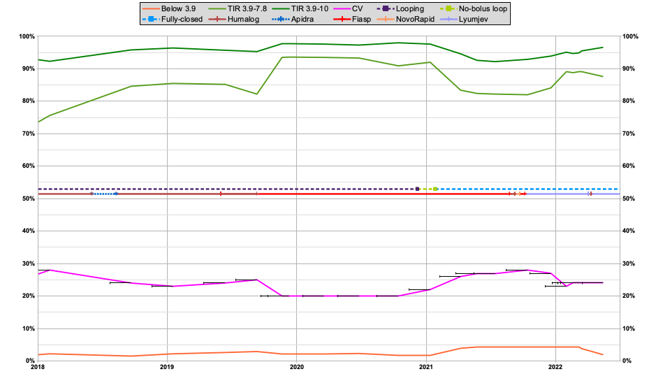
At the top are the TIR lines for 3.9-7.8 and 3.9-10. These showed a marked improvement in late 2019 when I fully switched to using Fiasp. The multi-coloured lines in the middle show the various insulins (and when I change looping modes). The TIR lines did drop back a bit in early 2021 when I went “fully closed”. But in the last 6 months as I’ve improved things they’ve started to come up again.
The pink line is showing the Coefficient of Variation (relative SD). The lower it is, the less variation in BG values. A common clinical suggestion is to aim below 33%, while observations in populations without diabetes have shown CVs as low as 17-18%. It also drifted up when I went fully-closed, but has come down a bit since.
The orange line is the time spent below 3.9 mmol/L. As you can see it was also higher for some of this time, but the graph is getting very flat down there, so let’s blow up that area:
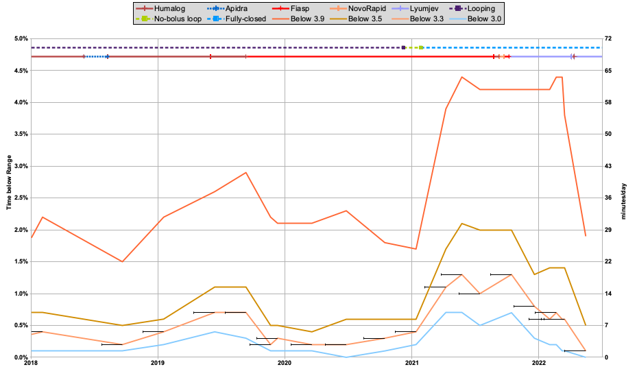
Things look a lot more dramatic when magnified. I’ve added some more lines here. The time spent below 3.9 mmol/L (70 mg/dL), 3.5 (63), 3.3 (59), and 3.0 mg/dL (54 mg/dL).
Those percentages are mapped on the right axis into a number of minutes per average day. Of course, the CGM data was only being sampled every 5 minutes, so a pair of points suddenly counts for 10 minutes.
In the preceding years I’d managed a TBR for 3.9 hovering around 2%, and had been pleased whenever I got lower than that. But when I started using the loop in a fully-closed mode, it very obviously jumped up. In fact to just over the 4% clinical suggestion outlined earlier.
But at least it wasn’t terrible, I told myself. There was after all a huge improvement in “quality of life” from the fully-closed setup. You can see all the other lines went up too, but most of the increase was in that 3.5-3.8 band. It was frustrating, but at least it was mostly just “dips” below 3.9.
A drop in the lower 3 lines after I started using Lyumjev (last year) was pleasing, but the top 3.9 line was stubborn. The change in modelling to a duration of 9 hours for Lyumjev (in early March) seems to have been key in dropping that too. Significantly!
Reviewing that latest AGP graph:
Compare that with the graph from February:

While the time in the 7.9-10 band seems to have increased lately, I’ve been more interested in what’s going on below the red 3.9 line.
In fact the highlight for me is:
My TBR stats are now back in the range I had when I was manually counting all my food and bolusing.
But I am still operating with a “fully closed” loop!
What’s next?
Up until this point I’ve mostly been using the standard oref1 loop algorithm, which is found in software such as OpenAPS, AndroidAPS, and FreeAPS X. I’ve been tuning the configuration for me (including paying close attention to the insulin modelling) and learning a lot, but have not made any significant changes to the algorithm itself. This is all using software which is available to everyone.

But of course “time and tide wait for no man”, and I’m not known for waiting either. With this latest set of bloodwork out of the way, now it’s time to test out things like some subtle code changes which I’ve had percolating in the background (running on test systems fed by my live CGM data so I could observe the effects). This is different to the “dynamic ISF” implementation that many people have been experimenting with. I’m hopeful it might help me improve my live stats at least a little further, and I’m sure I’ll write about it in more detail once it checks out. But we will have to wait a bit to gather the data! I’ve also been investigating the behaviour of Control-IQ, but that’s another story for later…
We all really appreciate your sharing of personal results which show what IS possible with very careful and knowledgeable self-management. Well done. A large thumbs up David – and a huge smile 🙂
Regards,
“Down Under” Aussie Barney Blue!
Will be very interested to read your upcoming thoughts regarding C-IQ, and any other readers too.
Our initial feeling is a bit “meh”; we were working very hard at keeping our teenagers results in a good place anyway (TIR of 80+% 4 or 5 days a week, and trying for 70+% the others, of course not always successful in either) , with a fair bit of burnout shared between parents and child, and were hoping for a noticeable improvement to take the pressure off.
Suspect now C-IQ helps more when thre is a greater improvement to be made, certainly waking hours are still very (perhaps more?) variable than before, after a couple of months on it.
Would love to hear others thoughts on what settings to tweak to improve!
After 30 years of running an A1c of around 6.7-7.5% on MDI, I started looping a year ago after neuropathy has set in the past few years.
I am trying to run a very tight ship with BS averages below 100 mg/dl and therefore I am bolusing for meals. I don’t see the advantage in waiting for the sugar to raise in order for the loop to trigger a response. This is precisely the advantage of knowing that I ate and that sugar will inevitably raise in the near future, for which I can bolus without waiting for a BS rise.
In fact depending on how aggresive I am, blood sugar can stay nearly stable even after the meal. While bolusing too much risks bringing you into hypoglycemic territory, one can just bolus enough to blunt the initial post-meal raise and let the loop deal with the rest of it… At least that’s the theory 🙂
There’s a certain amount of theory vs practice going on here.
Yes if I count my carbs, announce them and bolus, my TIR was great, and my HbA1c drifted as low as 5.0%. Without undue hypo risk.
And yet now with my current setup I don’t count my carbs, I don’t announce them, and I don’t bolus. And yet my TIR is close to what it used to be, and my HbA1c has stayed in the 5.2-5.5% range. And in the weeks since I posted this article the stats have kept improving: over the last month my time below 3.9(70) has been <1%.
Yes it's easy to think that the system will have to wait for the BG to rise before dosing, and this might add too much latency and thus we'd end up going high. But usually it doesn't work out that way.
For example a rise will usually start as a slight increase, and gradually accelerate. Each time a CGM update comes in the system will evaluate the history and in the face of BG rises will start to increase the insulin. So by the time things really kick in (and a human looking at the graph would say "ok, it's time to do something") the system has already started dosing some time beforehand. Obviously it then accelerates the dosing, but every extra 5 minutes there's more insulin going into the system and the lower that eventual peak is.
I think there are lots of little things like this that all add up and contribute to the overall performance. Using faster insulins (faster in both onset and cessation) doesn't hurt either.
In the telecommunications world I remember dealing with file transfer protocols running on 10 Mb/s, 2 Mb/s, and 48 kb/s links out to company offices. Many managers looked at the numbers and extrapolated in their heads what the performance was going to be like. But most of the time they were completely wrong. When we actually used the systems we noticed some of the complex timing interactions that meant tiny differences at the underlying level blew up to huge performance differences for the user. And optimising some tiny components had huge flow-on benefits.
Yes there’s a trade-off of more-effort being associated with “better” clinical numbers. But I’m continually amazed with how much less effort is needed to still produce great clinical results, but at the same time producing a “better” experience. Quality-of-life and all that.
Pretty amazing, thanks for posting the engineering experience example…
I found myself drifting higher (i.e. over 100 mg/dl) for extended periods of time without manual boluses. This would be perfectly ok for most people but for me it’s difficult to sit back and watch when I see the upwards trend 🙂
What’s true is that I have to frequently counter threats of hypoglycemia when the downward trend is accelerating.
If I build up enough mental fortitude I may try to gradually give up some control and see how it goes, even if BS averages go slightly higher…