
I’ve been gradually making tweaks to my personal looping/pumping/CGM setup over the last year, and there are some insights to be seen in the graphs that I’d like to point out. Some of the information in this article is stuff I’ve discussed before (last March) but there is some new data here.
Especially some insights which have come up in online discussions recently (such as the impact of Fiasp, and the possibility of not issuing insulin boluses). So I figured it was worth revisiting the (updated) graphs.
The Old Days
I’m going to be showing a series of graphs in this article, and there’s a lot of information in some of them. I’ll try to list through the highlights. Let’s start with data from the first 49 years of my life:
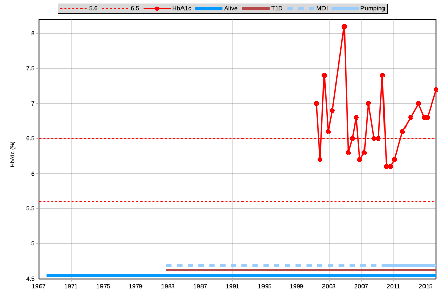
The only metric shown here is the HbA1c, which traditionally was the only convenient information we had to gauge our diabetes management. But I’ve added some other markers to the graph.
I’ve drawn a dashed line at 6.5% HbA1c, representing a commonly-used target that doctors were happy if we managed to keep our HbA1c below.
I’ve also drawn a line at 5.6%, being the top end of the “reference range”. Someone without diabetes would be expected to have an HbA1c within 4.4-5.6%.
Note that I have no HbA1c records from prior to 2001 (the first 18.5 years of my T1 diabetes).
In 2010 I started using an insulin pump, and my HbA1c seemed to immediately improve. It did gradually rise after that though.
On the whole my HbA1c was a surprise to me every time I got an update from my doctor. I didn’t have much overview as to how I was trending. And I didn’t look at a graph like this: it was just a “score” each time. Especially before I started pumping, you can see my HbA1c skipped around a lot: I wasn’t especially aware of my results.
By the right side of this graph in 2016, I didn’t feel especially “in control of my diabetes”. The HbA1c value was still bouncing around a bit, in a range that was edging into the territory of “increased risk” for all sorts of long-term health complications.
The next phase
Here’s an updated graph, showing the HbA1c up until today:
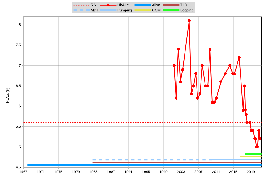
As you can see, my HbA1c results very quickly started coming down. What changed?
I started using a CGM in 2016. Libre at first, and later Dexcom G5. With more BG data than just the previous occasional fingerpricks, I could see the effects of exercise and various food. I quickly started making changes to my insulin dosing.
Then in 2017 I started looping (with an opensource closed-loop system using the data from that CGM). At first I was using OpenAPS, although in 2018 I moved to AndroidAPS which I’m still using today. The loop makes tweaks to my pump every 5 minutes: based on the CGM data, any bolus information it reads from the pump, as well as information I give it about things like carbohydrate intake.
Very quickly my HbA1c dropped to 5.6%: the edge of that reference range. And it’s remained below that ever since.
But HbA1c is not the only metric!
The continual data recording of the CGM can be very empowering. We don’t get to just see the current BG number and a trend arrow. We don’t just get to see how our body reacted to the last meal.
We also get to see how often we’re getting into hypo territory, how much time we’re spending “in range”, measure how variable our BG is, and estimate our HbA1c so the lab result is no longer a surprise every time. I’ve written previously about estimating HbA1c results.
And if we can see those patterns, we have a chance to modify our behaviour and treatment to affect them!
Having a background in IT, I’ve managed to keep records of almost all my CGM data back to when I started using Libre in 2016. I didn’t analyse all these metrics back then, but I’ve been able to recalculate them from the raw data. So here’s a very busy graph.
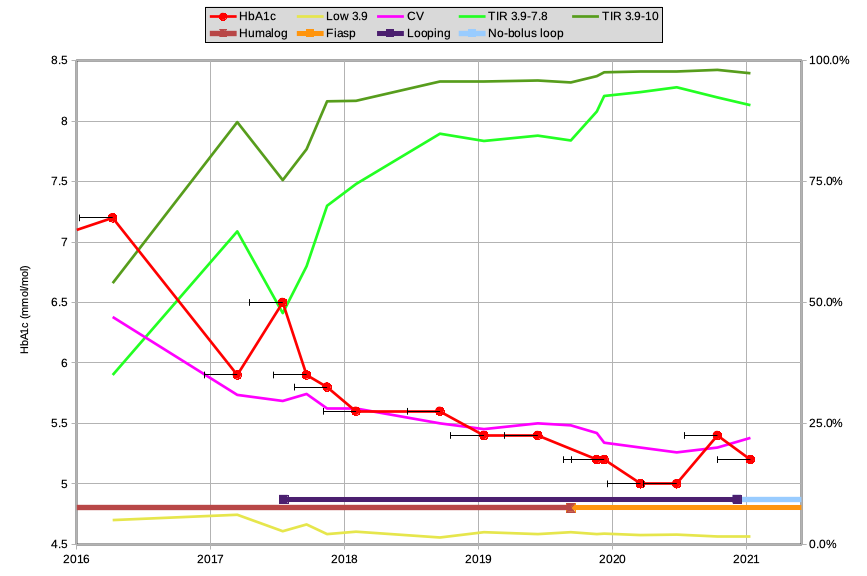
The red HbA1c line is from the previous graph: just magnified.
The black bar extending to the left of each point represents the previous 90 days (the data which affects the HbA1c result, and from which the other metrics have been calculated).
The other graph lines are measured against the scale on the right side of the graph:
The dark green line shows the Time-In-Range for 3.9-10 mmol/L. The default range that clinicians usually refer to when gauging TIR. A common goal espoused is to get at least 70%.
The light green line below it shows the TIR for 3.9-7.8 mmol/L, which is the range I’ve been measuring myself against since 2018. I’ve written previously about moving Targets and Goals.
The pink line shows the Coefficient of Variation (or the “relative SD”) which is a mathematical measure of how variable the BG value is. A commonly-suggested target is around 30%, although studies have shown that people without diabetes usually maintain a CV of less than 20%.
The yellow line at the bottom is showing the percentage of time spent below 3.9 mmol/L.
It’s probably worth repeating that the numbers shown here have been calculated over 90-day periods. Individual days can come in with better numbers: even 100% in range. But the 3-month averages should even a lot of that out.
Observations/Insights
This is the same graph again (simply here so less scrolling is needed).
My HbA1c dropped to 5.9% in early 2017, but I was having quite a few hypos. That yellow line was at 6.1%!
My endocrinologist helped me reset my pump settings, and the hypos started to go away. The HbA1c did also go up to 6.5%, although my TIR decreased a lot.
The dark blue line at the bottom shows when I started looping in mid-2017 (almost immediately after that 6.5% measurement). Ever since I’ve gradually refined my insulin and loop settings. Most of the metrics on this graph improved immediately, although that “hypo” line did tick up slightly while I was getting used to the system. But very quickly I got used to trusting the system to manage my BG, eventually just checking on it occasionally (confident it wasn’t likely to be “off in the weeds”).
In late 2019 I switched insulin from Humalog to Fiasp (see the brown/orange transition at the bottom). Keeping in mind those 90-day analysis windows, there were some immediate improvements from the plateau I’d been on for the previous year. The pink CV metric improved (less variation), and both TIR metrics improved. Especially that 3.9-7.8 TIR line! The loop was able to react to BG changes faster than previously.
2020 involved a bunch of lifestyle changes due to COVID lockdowns (especially here in Melbourne). Later in the year my HbA1c climbed slightly, which I was expecting due to the increased bicycle exercise I’d been doing (running my BG target slightly higher for periods to avoid hypos, etc). But overall it didn’t seem like a backwards step!
Towards the end of 2020 I changed the way I operate my loop. I have not issued any boluses since the start of December! I will sometimes announce carbohydrates to the system, although especially for smaller meals I trust its UAM (UnAnnounced Meal) detection. I wrote about this with Christmas recently.
I look forward to seeing how the TIR/CV/etc develop over time, but overall they’re still in a good place.
Do keep in mind that this no-bolus functionality is not something I could just “plug in and turn on” to get from Day 1 of looping. Or even Day 1 of Fiasp. I’ve found it works well for me, but I’ve had a long time to be confident that I’ve tuned my settings to the right levels for me. But once I started using it, my diabetes has receded further into the background of life.
“Quality of Life”
Overall I am paying less attention to my CGM data and my diabetes. I am able to spend more time just living life. From my earlier experience with Humalog, I know that this “no-bolus” functionality really benefits from Fiasp. I am looking forward to one day getting access to Lyumjev insulin (already available in Europe and the US) which should help make the loop even more responsive.
Just like Fiasp is the accelerated version of NovoRapid, Lyumjev is the accelerated version of Humalog.
Visualising data is a massive win!
All of the above may sound like a series of brags, but it’s intended to illustrate the insights we can get from reviewing our data.
For example when I started using 100% Fiasp I saw quite quickly that my results were improved. It took a lot of the guesswork and “feelings” away.
Having data such as that from a CGM gives us a useful tool with which to manage our diabetes in the short term. But looking at the longer-term retrospective patterns gives us even more information.
You can look at data in Diasend, Dexcom Clarity, Nightscout, Tidepool, and more. Over the years I’ve had data in most of them, and sometimes the one you’re using doesn’t quite have the analysis/reports you need. The above summary data has been graphed from a simple spreadsheet that has calculated data in it from all of the above sources (and more).
Collecting data is essential. But graphing the results is where we can see patterns, gain insight, and move forward.
Thanks for your willingness to share David.
I have modelled some of my own graphs against your previous blogs and am motivated to make some changes to them (and my AAPS settings of course) after reading this today. It was also good to hear from you sharing your insights on Saturday at Tims event. Thanks